I seem to be doing things in twos this week.
`````````````````````````````````````````````````````
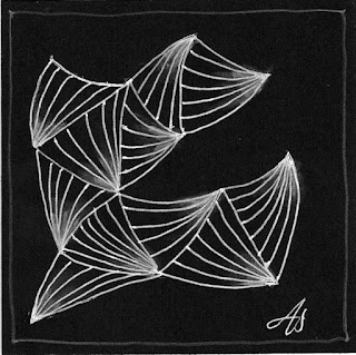
First off, the Diva's challenge is to use Munchin,
and she suggested doing it white on black.
Unlike some other tanglers who said they don't like doing white on black, I love doing so. I had already done one when I watched Molly Hollibough's video on doing Munchin.
And then I decided to do one with curved lines:
I like them both a lot; I hope you do, too.
Be sure to visit the Diva's site to see the other wonderful entries; it's amazing how different all the responses are. Maybe you'll be inspired to try out one of the Challenges yourself.
````````````````````````````````````````````````````````
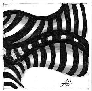
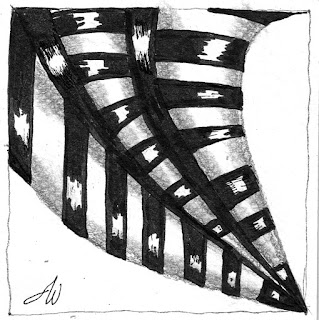
Next up was Joey's Challenge #82,
a Striping Monotangle:
I wasn't sure about this one; so I did another:
I like this one better, but I decided to post them both after all.
Take a look at joey’s site to see the other entries, and maybe try one yourself.


Very beautiful, Audrie, I'll try a curvy one too.
ReplyDeleteI like both Diva tiles too! The second one is my favorite ;-)
ReplyDeleteThe second is so dramatic!
ReplyDeleteBeautiful, both of them. I like the idea of adding curves. Must try!
ReplyDeletethat curvy Munchin is beautiful, and I love the first Striping tile. The shading in that one makes it so solid looking. Love it!
ReplyDeleteGreat tiles~all of them. I really like that last Striping tile.
ReplyDeleteLove all of these (I did both these challenges this week). I tried curves on mine too. Particularly like your tile with the curves.
ReplyDeleteGreat tiles. Those cut out curves on the first one are a clever idea aren't they. My favourite is the curvy Munchin
ReplyDeleteBeautiful! :)
ReplyDeleteAll are wonderful! Especially I like the version with the curvy lines!
ReplyDeleteAudrey, I love all your tiles. Looks like you had fun with the Munchin, and I really like the curved one. Your striping tiles are so bold! It looks like you used two different types of paper because the shading looks different. Whatever you did, it works!
ReplyDeleteYes, curves...a very simple alternative that of course I've not thought of! Maybe I'll like Munchin a bit better if the lines were curved!! And so I'm off to give it a try :) Lovely!
ReplyDeleteI'm actually glad that we were asked to use white on black. I don't usually do so voluntarily, but mine look a lot like yours. I think yours are great. ;-)
ReplyDeleteI'm actually glad that we were asked to use white on black. I don't usually do so voluntarily, but mine look a lot like yours. I think yours are great. ;-)
ReplyDeleteAll your tiles look great this week. I love the way that you changed it up by using the curvy lines in the second one. Your striping tiles are fun too; I love the first striping tile the most, I think
ReplyDelete