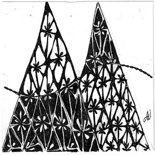
Tomorrow Square One posts the new focus tangle, so I guess I should post my tile for this past week. It was Finery,
and this is mine:
Check out the Square One/Purely Zentangle group on Facebook and see all the other entries for Finery and lots of others. Square One has you going back to the basics;
try it, you may like it
try it, you may like it
`````````````````````````````````````````````````````````
Next up is Joey's Weekly Tangle Challenge #69,
continuing with the Alphabet Monotangles,
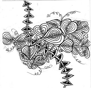
here's Florez:
Probably not one of my best efforts, but it'll do.
Take a look at Joey’s site to see the other entries,
and maybe try one yourself.
``````````````````````````````````````````````````
And here's It's a String Thing #101
Using String #101 by Yamit Fridman

Here's what I came up with:
Be sure to check out all the entries @ Tickled to Tangle, on Monday afternoon, when Adele Bruno posts them. The vast differences that can be achieved using the same tangles on the same string are truly incredible. And, if you've a mind to try a String Thing yourself, check back on Tuesday afternoon,
when she offers the new ones.
```````````````````````````````````````````````````````
Lastly, Katie Crommett, CZT, is the guest blogger on I am the Diva, and her challenge this week is "Simplicity". Use only 2 or 3 tangles, and leave some white space; I love white space.
This is definitely a case of "Less is More"
So with that in mind, here's mine:
Be sure to visit the Diva's site to see the other wonderful entries; it's amazing how different all the responses are. Maybe you'll be inspired to try out one of the Challenges yourself.
Have a great day, see you next time


I'm a Diva challenge person, so I'm commenting on your last tile. You definitely complied with the spirit of this challenge. Even without shading, you managed to incorporate depth and movement in your "simple" tile AND leave negative space. Good job!
ReplyDeleteHow did you do that amazing floating cube!?!
DeleteThanks for your very favorable comment.
DeleteI love the perspective that you've give Bales in your Simplicity challenge! Lovely work. :)
ReplyDeleteThank you.
DeleteI do like your 'less is more' tile.
ReplyDeleteThanks, Annemarie.
Delete