This week marked the 300th challenge from the Diva;
and it's the annual Moebius Syndrome Awareness challenge.
Can you believe it? 300 challenges. Laura Harms, the Diva,
has been issuing weekly challenges for 6 years.
Laura's son, Artoo, was born with this syndrome
(it's not a disease); find out more about it on her blog:
I am the Diva . And she poses the Moebius Syndrome
Awareness challenge every year during the week
of Moebius Syndrome Awareness Day, which was
Tuesday, I believe. And Purple is the color of the day;
which is right up my alley, since I am definitely
a Purple Person.
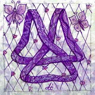
This is the Moebius Foundation's logo; which is
used as the string for this challenge:

But I tweaked it a bit. Here is my tile:
Unfortunately, I got a little behind on my challenges this week,
which is why I'm posting my tile at the 11th hour. Better late
than never. I hope you like it.
Be
sure to visit the Diva's site to see the other wonderful entries; it's
amazing how different all the responses are. Maybe you'll be inspired to
try out one of the Challenges yourself.
http://iamthedivaczt.blogspot.com/
http://iamthedivaczt.blogspot.com/
```````````````````````````````````````````````````````
Joey's Challenge #149
Joey's challenge #149 continues the Finish My Tile
format. But this series uses alphabet strings, with
corresponding tangles of the same letter. Since this is the
fourth challenge of this format, we are on the letterD.
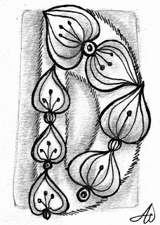
Here's Joey's beginning tile, using Dicso, on a ZIA/ATC:

And here's my tile; a monotangle as usual:
I originally wanted to do this challenge in color. But
it really wasn't working; so after a few tries I just gave
up and did it in black on white, with graphite shading.
Take a look at Joey’s site to see the other entries,
and maybe try one yourself.
and maybe try one yourself.


Love your wavy ,tweeked tile! Great purple butterflies! :)
ReplyDeleteI like your tweaked Moebius symbol - such a hard one to get right! Your Dicso is big, bold and lovely.
ReplyDeleteBoth tiles are great, But I really admire the way you tweaked the Moebius symbol. Stunning! I know from the past Moebius challenges that I just can't get it right, so I'm not even trying this time. Using the letters MSAD...Moebius Syndrome Awareness Day...instead.
ReplyDeleteLove the D challenge, also!!
Joyce
A lovely DIva tile with a very special logo that I really like.
ReplyDeleteI agree with you, sometimes a tile looks better with colours but sometimes I prefer just black and white. That is allright, it is nice to have some variation in your work!
I had trouble with my D too, sometimes things need a second try (or 3rd, 4th----) before you really feel it's going the way I want it to. Looks lovely in black.
ReplyDelete